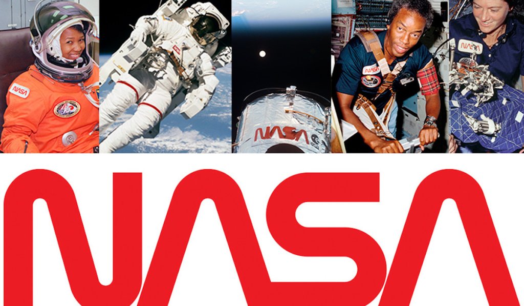
Sightings of the NASA logotype (the “worm”), from left: Astronaut Mae Jemison preparing for launch; astronaut Bruce McCandless on an untethered spacewalk; the Hubble Space Telescope; astronaut Guy Bluford; and astronaut Sally Ride.
Mercedes Benz’s three pointed star. McDonald’s’ Golden Arches. Apple’s apple. Nike’s Swoosh.
NASA’s…. Worm? Yup, it’s back!
A logo can be an important part of an organization’s identity. It conveys professionalism and gives a familiar symbol that puts you at ease. We have all been on that road trip, looking for a place to eat in an unfamiliar location and seen those familiar Golden Arches. We have shopped for computers and looked for the Intel logo on the keyboard. Logos are a big part of marketing and make companies stand out from the crowd or be lost in the sauce.
Changing a logo can also sometimes cause your organization to be subject to criticism or ridicule. The Cleveland Browns infamously changed their logo from an orange helmet to slightly more orange helmet as if it were going to make people forget about how abysmal the team was. The New York Islanders replaced the logo they used to win four Stanley Cups with a character that looked just like the Gorton’s fisherman.

The “Meatball.”
NASA has had two iconic logos over the course of its illustrious history. The first, nicknamed the meatball dates to 1959 and was approved by President Eisenhower. It was the logo that took us to space for the first time, around the earth and to the moon and back. In the 1970s, as NASA modernized, it looked to change its image and logo.
In 1975, the firm of Danne and Blackburn released a futuristic logo that was well ahead of its time. Dubbed “the Worm,” it became just as iconic as the meatball logo as NASA evolved its missions from moon landings to the new Space Shuttle System. The two letter As in the logo were missing the middle line which makes them look like the top of a rocket. The new logo was a smash and became synonymous with the Space Shuttle and era of the 80s.
But tradition came back and in 1992, the meatball was reinstalled as the primary logo. The Worm remained on vestiges like the Enterprise; the Shuttle prototype that is now at the Intrepid Space Museum and on the famous Hubble Space Telescope.
Recent events, however, have led NASA to bring back the logo. Part of it is nostalgia to be sure. But there is a new era in America’s space journey and NASA wanted to usher it in with a bit of rebranding.
Since 2011, after the Space Shuttle program was shut down, Americans have only been able to make it into space by hitching a ride with the Russians. Our trips back and forth to the International Space Station hinge on a partnership with the Russian Space Agency. While this was supposed to be a cost-saving measure, it also meant that the United States went from building the Saturn V which sent men to the Moon, to designing a shuttle that could be used multiple times, to not having anything at all.

Enter Elon Musk. The billionaire entrepreneur is leading the charge in an American effort to put humans on Mars. As part of that, he has invested heavily in rocket development though his company, SpaceX. SpaceX has a new rocket, called the Falcon 9, which will be the first launch on American soil that will take Americans to space since 2011.
With the new rocket and era in American space flight, the Worm which is retro and modern in design helps capture the excitement of this new time in human spaceflight. The launch is scheduled for May and is still on track to be launched.