It’s that time of year again. Really, it’s one of those times of year again. There’s a big holiday coming up, so Major League Baseball is breaking out special caps for their players to wear on the field (and for fans to buy). Released just in time for our great nation’s 249th birthday, MLB is offering special July 4th-themed hats for every team to rock.
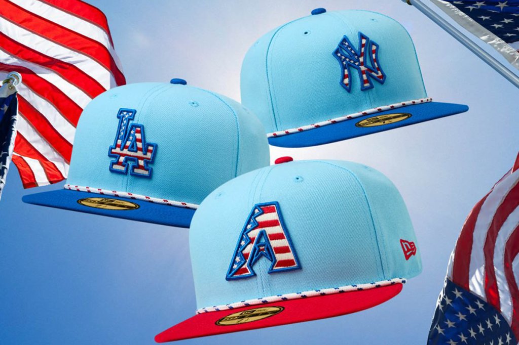
New Era Caps has designed baby blue hats for every team, each with an American flag inside the team’s logo. Across the brim is a red or blue cord, across a red or blue brim. It seems that there is some reason behind the brim colors. Teams that traditionally wear blue like the Los Angeles Dodgers and New York Yankees, will have a blue brim. Teams that usually wear red, like the Boston Red Sox or Cincinnati Reds, well, you guessed it – the brims will be red.
But most of their uniforms will remain the same. For better or for worse.
So for the teams that chose not to have team colors that match the colors of the United States, they will get to display a wonderful clashing of colors. The San Diego Padres’ brown might be the most egregious clash of all, unless they break out their military-themed jerseys.
Some of you may be wondering, “What about our neighbors up north?” Well, I have no idea when Canadian Independence Day is, but in baseball terms, they get to celebrate our independence as well. The Toronto Blue Jays will, of course, be rocking red… because Canada.

Now, many baseball purists might hope that the powder blue caps would make some teams want to break out throwbacks from one of the greatest eras in sports uniform history: the 1980s baby blue uniform days. How amazing would the Atlanta Braves, Philadelphia Phillies, or St. Louis Cardinals look rocking these July 4th hats along with baby blue throwbacks?
Let’s take a second to pour one out for the great blue unis of the Montreal Expos… man, those were beautiful.
The star-spangled brims on July 4th hats produced by MLB date back to the immediate post-9/11 era and started with a simple flag patch sewn on the side of the cap. Things got more specific in 2008, when every team wore navy blue hats with a star-spangled logo.
It looked great if you wore blue, but teams like the Oakland A’s had to stand around wearing green and yellow with a blue hat. The very next year, MLB decided that red was better and we had to watch the San Francisco Giants match red with orange.
In 2012, Major League Baseball decided that clashing colors wasn’t working, so they decided to just break out the camouflage. There was nothing like seeing the then-Cleveland Indians rock a camouflaged Chief Wahoo while celebrating the birth of our nation.
In 2018, the hats decided to honor the Declaration of Independence by displaying the Preamble to the Constitution on the brim. Civics, people…

The styles came and went, but the tradition stayed. This year’s look may be appealing to some and appalling to others, but to each their own. And as far as colors clashing, it may make the editors of Vogue shudder to see the Padres potentially match brown with the stars and stripes, but the average American seems to like seeing their beloved team’s branding espousing the red, white, and blue.
Don’t Miss the Best of Mighty Sports
We Are The Mighty is a celebration of military service, with a mission to entertain, inform, and inspire those who serve and those who support them. We are made by and for current service members, veterans, spouses, family members, and civilians who want to be part of this community. Keep up with the best in military culture and entertainment: subscribe to the We Are The Mighty newsletter.