President Trump unveiled the Space Force logo today via social media and Star Trek fans everywhere are thinking the “coincidence” in appearance to the Starfleet Command logo is “highly illogical,” “clearly copied,” and our personal favorite: “a blatant f****** ripoff.” – The great people of Twitter
The other half of Twitter is furious at the accusation that the logo was copied, citing the 1982 design of the United States Air Force Space Command logo, and saying it’s just an update of that and to blame not Trump but Reagan and #journalism for not researching the history of the logos. Still others are saying it all started with NASA and Big Brother always wins.
So what came first: the chicken, the egg or the alien?

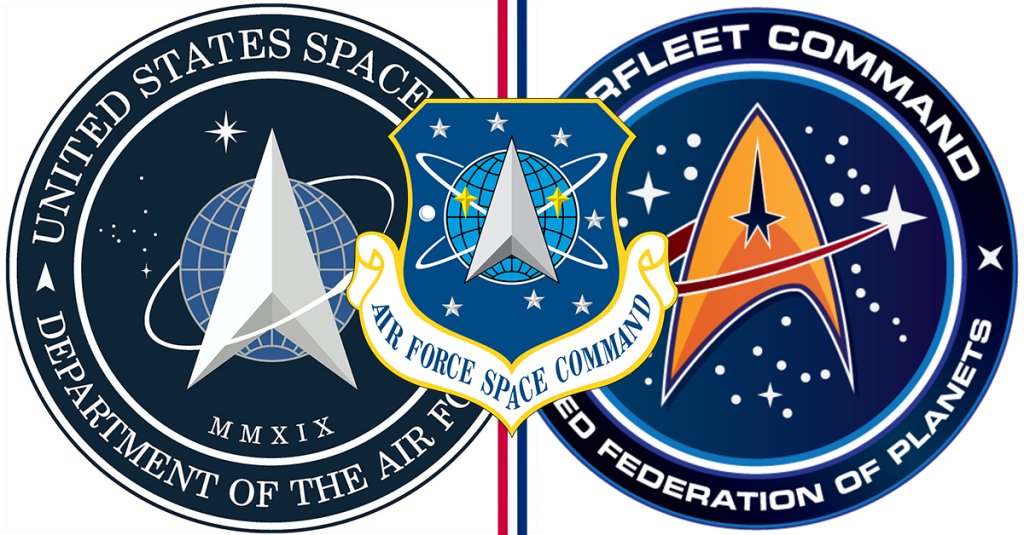
1. Starfleet Command
To be fair, Starfleet Command is credited as being founded between 2030-2040 and we all know if you’re not first, you’re last. But put the future aside and if we’re just talking about facts, this bad boy was created in the 1960s. According to startrek.com, “The delta insignia was first drawn in 1964 by costume designer William Ware Theiss with input from series creator Gene Roddenberry. The delta — or ‘Arrowhead’ as Bill Theiss called it — has evolved into a revered symbol and one that’s synonymous with Star Trek today.”
Star Trek does acknowledge on their site that they were inspired by the NASA logo (NASA was established in 1958): “In the Star Trek universe, the delta emblem is a direct descendant of the vector component of the old NASA (and later UESPA) logos in use during Earth’s space programs of the 20th and 21st Centuries. Those symbols were worn by some of the first space explorers and adorned uniforms and ships during humanity’s first steps into the final frontier.”

2. Air Force Space Command
We’re not IP experts here, but this looks SUPER similar to Star Trek’s. Like almost the same. Sure they added a globe and changed some of the stars around a bit, but this feels a little bit like the Under Pressure vs. Ice Ice Baby debate.
Founded in 1982, the Air Force Space Command was a major command based out of Petersen Air Force Base, with a mission to provide resilient, defendable and affordable space capabilities for the Air Force, Joint Force and the Nation. Their vision: innovate, accelerate, dominate.
Kind of feeling like maybe the innovative piece didn’t extend to logo design. Too soon?

3. SPACE FORCE!
It’s hard for us to even say Space Force! without an exclamation point at the end, so we are disappointed that one wasn’t included in the logo. We do, however, appreciate the addition of the Roman numerals to make it look extra futuristic, with the acknowledgement that the average American’s understanding of Roman numerals only goes as high as the current year’s Super Bowl.
You be the judge: Star Trek, Space Force or not seeing it?